The Dashboard is the first thing you see when you open a project. It gives you a live snapshot of how the project is progressing — task completion rates, overdue work, interruption history, team workloads, and team sentiment.
Getting there
Open a project → Dashboard (default landing page)
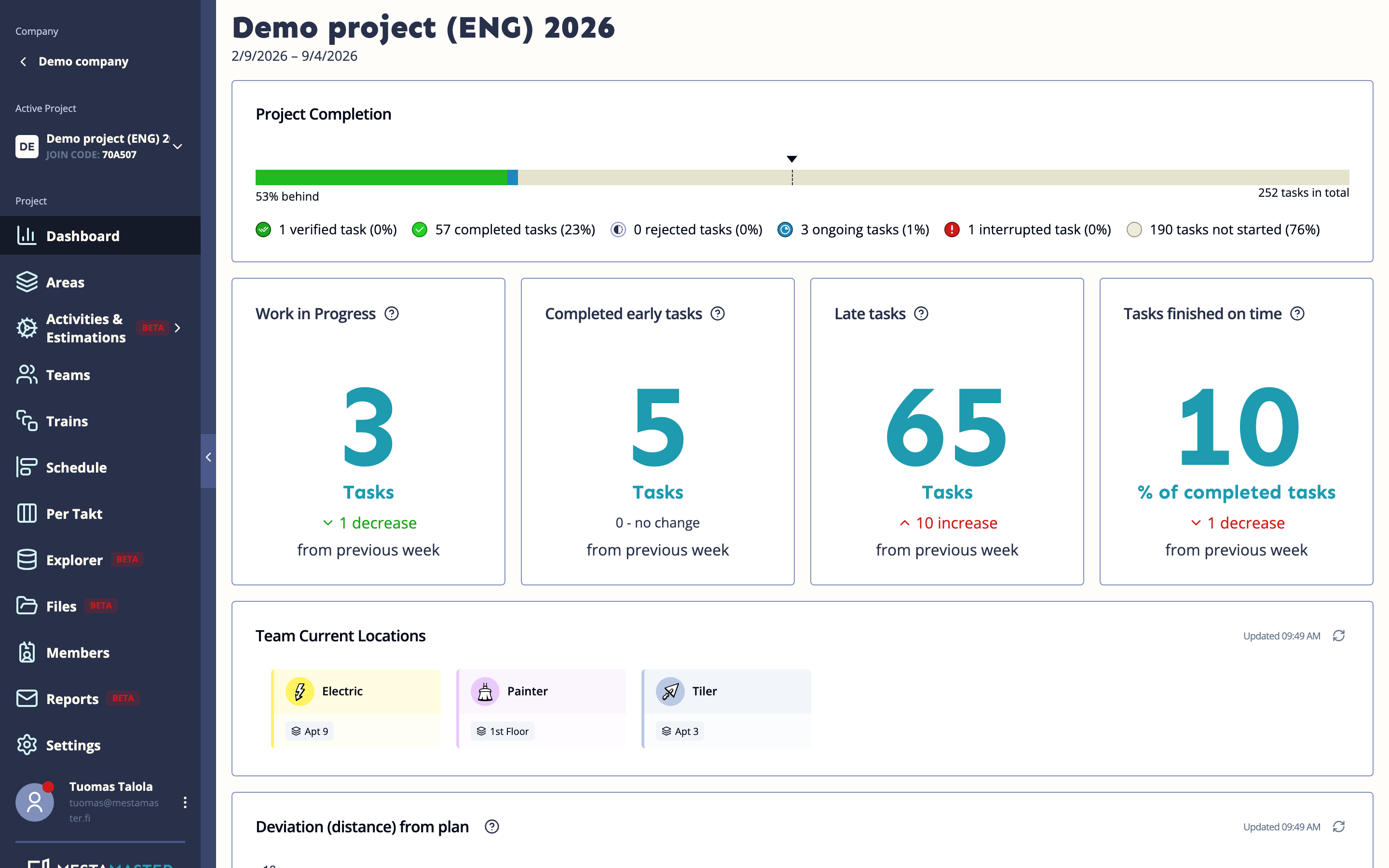
Project Completion
A progress bar at the top showing overall project completion as a percentage.
KPI Stats
Four numbers shown as cards below the progress bar:
| Card | What it means |
|---|---|
| Work in Progress | Tasks currently started but not yet complete. Too few means the team is idle; too many may mean work is stuck or workers are juggling too many tasks at once. |
| Completed early tasks | Tasks finished before their planned start date — gives a sense of how much buffer exists ahead of schedule. |
| Late tasks | Tasks whose due date has passed and that are not yet complete. The most direct indicator of delays. |
| Tasks finished on time | Percentage of completed tasks that were done by their due date. Note: this metric shifts slowly toward the end of the project, so it reflects history more than the current moment. |
Each card also shows the change compared to the previous week.
Team Current Locations
Shows which spaces each team is currently working in, based on their active tasks. Useful for knowing where to find a team on site.
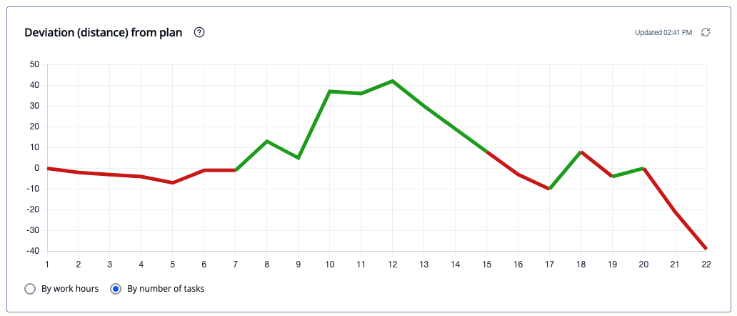
Deviation (distance) from plan
How far ahead or behind the schedule you are, per takt, expressed either in work hours or number of tasks. Positive values mean ahead of plan, negative means behind. Use this to spot trends — a steadily worsening line is an early warning of a larger problem.
Toggle between By work hours and By number of tasks using the switch in the chart header.
Pulse
(Visible only if the Pulse feature is enabled on the project)
The Pulse section collects anonymous feedback from workers via the Toolbelt app. Workers are periodically asked a short question about how the schedule is going — their answers feed into two views side by side:
- Pulse gauge — a single dial showing the current average sentiment across all teams (higher = better)
- Pulse heatmap — a grid showing each team’s pulse score over time, week by week
Participation is voluntary and all answers are anonymous.
Interruptions Over Time
A chart showing how many interruptions occurred per takt. Use this to identify patterns — recurring spikes often point to a systemic problem (a repeated delivery failure, a recurring access issue, etc.).
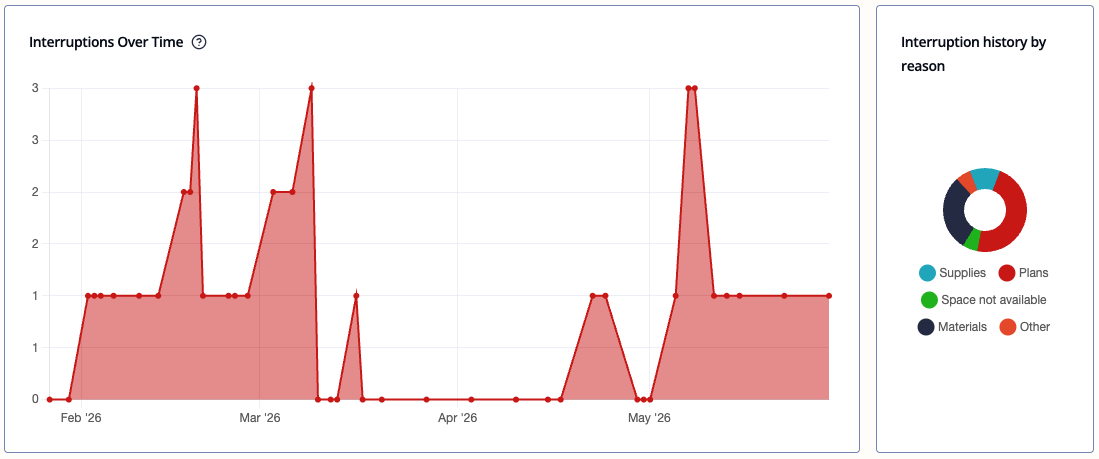
Shown side by side with Interruption history by reason.
Interruption history by reason
A breakdown of interruptions by cause. Reasons include: materials, plans, equipment, supplies, space not available, space not clean, previous task not done, and other. Useful for identifying the dominant bottleneck category across the project.
Interruption Log
A table listing every interruption on the project. Columns: state (active or resolved), task, team, reason, comment, created time, resolved time, and time spent. Click any row for full detail.
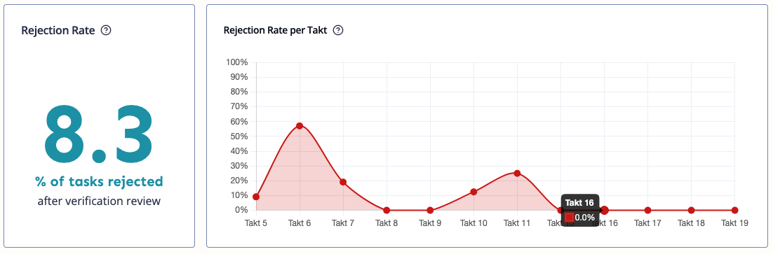
Rejection Rate
(Visible only if the verification workflow is enabled on the project)
A single KPI card showing the percentage of completed tasks that were rejected during quality review. Lower is better. Shown alongside the Rejection Rate per Takt chart.
Rejection Rate per Takt
(Visible only if the verification workflow is enabled on the project)
A line chart showing how the rejection rate evolves across takt periods. High rates early in the project are normal as teams calibrate their quality standards — a persistently high rate in later takts may indicate a systemic quality issue worth investigating.
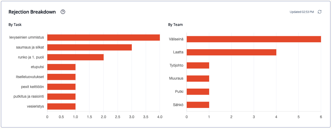
Rejection Breakdown
(Visible only if the verification workflow is enabled on the project)
Rejection events grouped either by task name or by team. Switch between the two views using the toggle in the chart header. A single task rejected multiple times is counted each time — making it easy to spot which specific tasks or trades generate the most rework.
Burndown
A line chart showing cumulative planned vs. completed work over time. If the project is on track, the two lines run close together. A widening gap means completed work is falling behind the plan.
Toggle between By work hours and By number of tasks.
Shown side by side with Started Tasks.
Started Tasks
A chart showing how many tasks were started on each day. Drops indicate scheduling gaps or team absence. A trend line is included to help filter out day-to-day noise.
Teams Workload per Takt
(Visible only if the Estimations module is enabled on the project)
A stacked or grouped bar chart showing planned work hours per team across all takt periods. Use this to spot over- or under-allocated periods before they arrive. Toggle between stacked and grouped views in the chart header.
Overdue Task history
A timeline of how many tasks were overdue each day. Useful for spotting when delays started and whether the project is recovering or worsening.
Shown side by side with Overdue Task Breakdown.
Overdue Task Breakdown
Overdue tasks grouped by team and task name. Use this to identify which specific trade or task type is the source of delays.
Tips
- The Dashboard loads fresh data each time you open it. Use the Refresh button on individual charts if you want to pull the latest mid-session.
- When 100% of tasks are completed, the app shows a small celebration.
- Several charts are only visible when certain features are enabled (Pulse, Verification, Estimations). If a chart you expect to see is missing, check Project Settings.